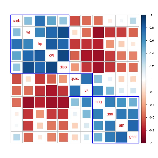
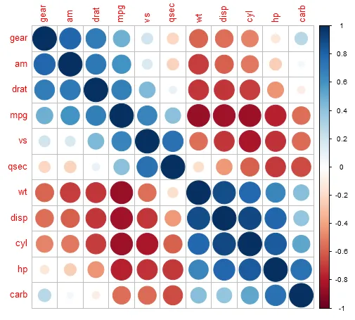
Correlograms are the usual go-to visualization for a correlation coefficient matrix. If your features set (set of variables in dataset) has only a few features, the human mind is able to eyeball the correlation co-efficients to glean the most important relationships. However, when the list of features is longer, eyeballing is time consuming and there are chances that we will miss out on a few unobvious but important details. As a rule of thumb, when the feature set contains more than 5 features, I prefer studying a corellogram rather than its correlation matrix for insights.

A correlogram can be created in many ways, using many packages (both in R and Python), each offering varying levels of flexibility to configure the visualization. Here, I dive into the R package of corrplot but you can carry forward the same learnings to another correlogram-visualization function from other packages in R and Python.
The basic steps followed in the creation of a correlogram include:
- Computing a correlation matrix or, taking a matrix of pre-calculated coefficients as input.
- Displaying the feature set of p features into a p x p grid.
- Displaying the pairwise correlation coefficients in this grid with the rows & columns names matching the corresponding feature pair. In the corrplot package, you can choose to replace the coefficients with small pie charts (full pie corresponds to correlation of 1, no pie corresponds to 0). Additionally, the shade of the pie denotes the direction of correlation. Other shape options include sqiuares, ellipses, the numerical value of the coeffiecient itself (larger font sizes for stronger correlations).
- Colouring the co-efficients using the user-prescribed logic.
- Ordering the co-efficients using the user-prescribed logic.
- Altering other aesthetics as defined by the user (title, font, color scales, etc.)
Here’s a code snippet for creating a basic correlogram using the corrplot package in R:
    corrplot(df_cor, #correlation matrix
         method = "color", #show coloured blocks
         is.corr = TRUE, #input matrix is a correlation matrix
         type = "upper", #show only upper diagonal of correlogram
         order = "FPC", #First principal component order
         addCoef.col = "black", #show numerical value of coefficient
         tl.col = "black", #text color of data label
         tl.cex = 0.5, #text size of data label
         rect.lwd = 3,#text size of data label
         tl.srt = 90, #text rotation of data label
         cl.cex = 1, #text size of color-legend label
         number.cex = 0.5, #text size of correlation coefficient
         diag = FALSE, #hide coefficient on the principal diagonal
    )
You can play around with the many parameters of the corrplot function. For now, let us take a closer look at the ‘order’ of correlograms. In the above example, I use the FPC order but what does this mean? To answer this, let us first take a step back: why would we want to order correlograms?
Why order correlograms?
We visualize data for a variety of reasons — one of those being for data exploration. This is the phase where we make charts to enable ourselves to discover underlying patterns in our data. For better synthesis of our ideas about our data, it is natural to want to map similar elements together. For example, an alternative way of looking at a histogram is an ordered bar chart with observations of closer frequencies binned together — this assists in a quick understanding of the distribution of the data with respect to the chosen feature.
In short, exploratory data analysis is made easier by mapping similar or contiguous elements (features or observations) closer in a way that brings forth the hidden patterns in our data. This eases understanding of relations, trends, anomalies, etc. — lets the machine bring forth these patterns so that we may reserve our mental capacity for further questioning our dataset.
The quest for ordering corellograms is similar — throw light on patterns (in addition to the correlation) between features by ordering these using different methods, where each method focuses on finding similar features by employing different statistical procedures.
Ways of ordering a correlogram
The most commonly used ordering methods for correlograms are by:
- hclust or hierarchical clustering
- FPC or First Principal Component
- AOE or Angular Order of Eigenvectors
Each of these methods will result in a different ordering of the features — all based on the chosen similarity measure. How, then, do we chose which ordering mechanism to use? Which will help uncover the unobvious relations in the data?
Do we try on every method and eyeball the results to pick the most interesting one? Thankfully, not. We can employ a certain degree of scientific judgement to choose the most appropriate ordering procedure for our dataset. Let’s take a closer look at how each of the methods work and, the benefits and limitations of each.
Hierarchical Clustering (hclust)
Simply put, hclust reorders a correlogram based on the distance between features. Closest features (least distance) are ordered side-by-side and far apart from more distant features.
Note: If you are studying correlation coefficients as a precursor to clustering, do not confuse this with the distance (or similarity) matrix calculated for observations. Here, we’re looking for similar features and the plot applies a simple hclust algorithm to hierarchically order said features.
There are further ways to compute distance between features — 'ward', 'ward.D', 'ward.D2', 'single', 'complete', 'average', 'mcquitty', 'median' or 'centroid' — which is passed to the hclust.method argument in corrplot. For the sake of brevity, we won’t be discussing the different hclust distance measures. Suffices to say that each measure begins with the baseline that each feature is in its own cluster. Thereafter, it calculates pair-wise distance between the featues and the closest ones (least distance) are paired together. Then, once again, the distance is computed between all clusters (few independent features and few grouped in the first iteration) and, those with the least distance are grouped next. This continues till all features have been included in the hierarchy of clusters.
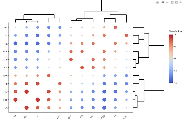
This hierarchy, of iteratively including features, is what is used to order the features in the correlogram. Hence, after ordering the correlogram by method = ‘hclust’, we not only see pair-wise correlated features but also groups of correlated features based on hierarchical clustering.
   corrplot(df_cor, #correlation matrix
         method = "color", #show coloured blocks
         is.corr = TRUE, #input matrix is a correlation matrix
         type = "upper", #show only upper diagonal of correlogram
         order = "hclust", #Hierarchical clustering order
         hclust.method = "average", #using the average linkage distance measure
         addCoef.col = "black", #show numerical value of coefficient
         tl.col = "black", #text color of data label
         tl.cex = 0.5, #text size of data label
         rect.lwd = 3,#text size of data label
         tl.srt = 90, #text rotation of data label
         cl.cex = 1, #text size of color-legend label
         number.cex = 0.5, #text size of correlation coefficient
         diag = FALSE, #hide coefficient on the principal diagonal
    )
Note: the above code will not auto-add dendograms to the correlogram. The below image is used to better differentiate the behind-the-scenes ordering process for hclust compared to FPC or AOE. You can use the R package heatmaply to add the dendograms to your correlogram.

Limitations of the hclust method:
- Representation of ties in hierarchical clustering is weak. That is, say, a feature having the same distance from 2 others features will create a tie — and this tie is arbitrarily broken by hierarchical clustering. This may result in arbitrary ordering of tied features.
- Even the most distant features will eventually be grouped into a hierarchical cluster. Distance numbers by themselves have no meaning. It is only in comparison, that we use distance to say that two features are closer than others. Hence, depending on the level of hierarchical clustering (say, a threshold = 1.0) may not reveal a new order in the feature set.
These limitations can be overcome by applying packages like
heatmaplythat remove the arbitrariness by visualizing the hierarchy next to the grid.
First Principal Component (FPC)
FPC is derived from Principal Component Analysis (PCA) which is popular as a dimension (feature) reduction technique. PCA creates new features (out of existing features) based on variance maximization — grouping together those parts of the feature set that explain the maximal variance in the model. FPC (or PC1) is the first dimension (explaining the max model variance) derived from this analysis.
For the sake of brevity, we won’t discuss how PCA works, but only focus on how the FPC is used to order features on the correlogram.
Mathematically,
\(FPC = a_{11}x_1 + a_{12}x_2 + ... + a_{1p}x_p\)
where,
x1:p refer to p features in the dataset,
a11:1p refer to coefficients derived from the covariance matrix.
From the equation, we see FPC is a linear combination of the original features which account for the maximal amount of variance in the feature set. Hence, the higher the co-efficient (a1), the higher the contribution of a feature to the FPC. The ordering of features in the correlogram, thus, comes from the ordering of the co-efficients of features in FPC.
Note: If you are using the correlogram as a precursor to clustering, the FPC order will give you an early indication of the features that contribute most to PC1 from your model.
Hence, in addition to correlation coefficients, the FPC order indicates the features explaining the maximal variance in the model. That is, the first feature contributes the most to the first principal component which, in turn, explains the most variance in the dataset. Conversely, the last feature contributes the least to explaining the variance in the dataset.
Angular Order of Eigenvectors (AOE)
The concept of eigenvectors comes from the basics of linear algebra and stretches to its application in computer vision and machine learning. To avoid spiraling into yet another field of statistics, we will restrict our discussion here to how the order of eigenvectors reveals similar features.
When the structure of correlations is well-described by a single, dominant dimension (as in a uni-dimensional scale or a simplex), ordering variables according to the positions on the first eigenvector of the correlation matrix suffices. However, real world datasets are rarely uni-dimensional.
Therefore, we look to the angles formed by the first and second eigenvector e1 and e2 of a correlation matrix. These angles are approximations of correlation between features and hence, this type of ordering places the most contiguously similar (sharing a common border) features together.
Mathematically, the order of the features is derived from the angles computed as so:

These angles sort the features into 2 major groups — those with positive correlations within, and those with negative correlations between, which makes it easier to visually consume the correlogram.

In summary, ordering of a correlogram is intended to help visually discern information from your feature set in addition to the correlation coefficients mapped in the central grid. When coupled with a smart ordering choice, the same correlogram can reveal multiple layers of information to better understand our feature set.
This being said,
We don’t have to restrict ourselves to only one way of ordering.
When in doubt, remember the purpose of the exercise: finding underlying patterns in the feature set. Each ordering method is valid so long as it is helping uncover previously hidden information. Being critical of our chosen methods is a good skill for every data scientist. Here too, remain critical of the value derived from each ordering method and, if there is value addition by more than ordering style, leverage these.
